The Ray brand.
The mark, the color, the type and the voice, with the rules that keep them consistent. Everything here is what the product actually ships.
The mark
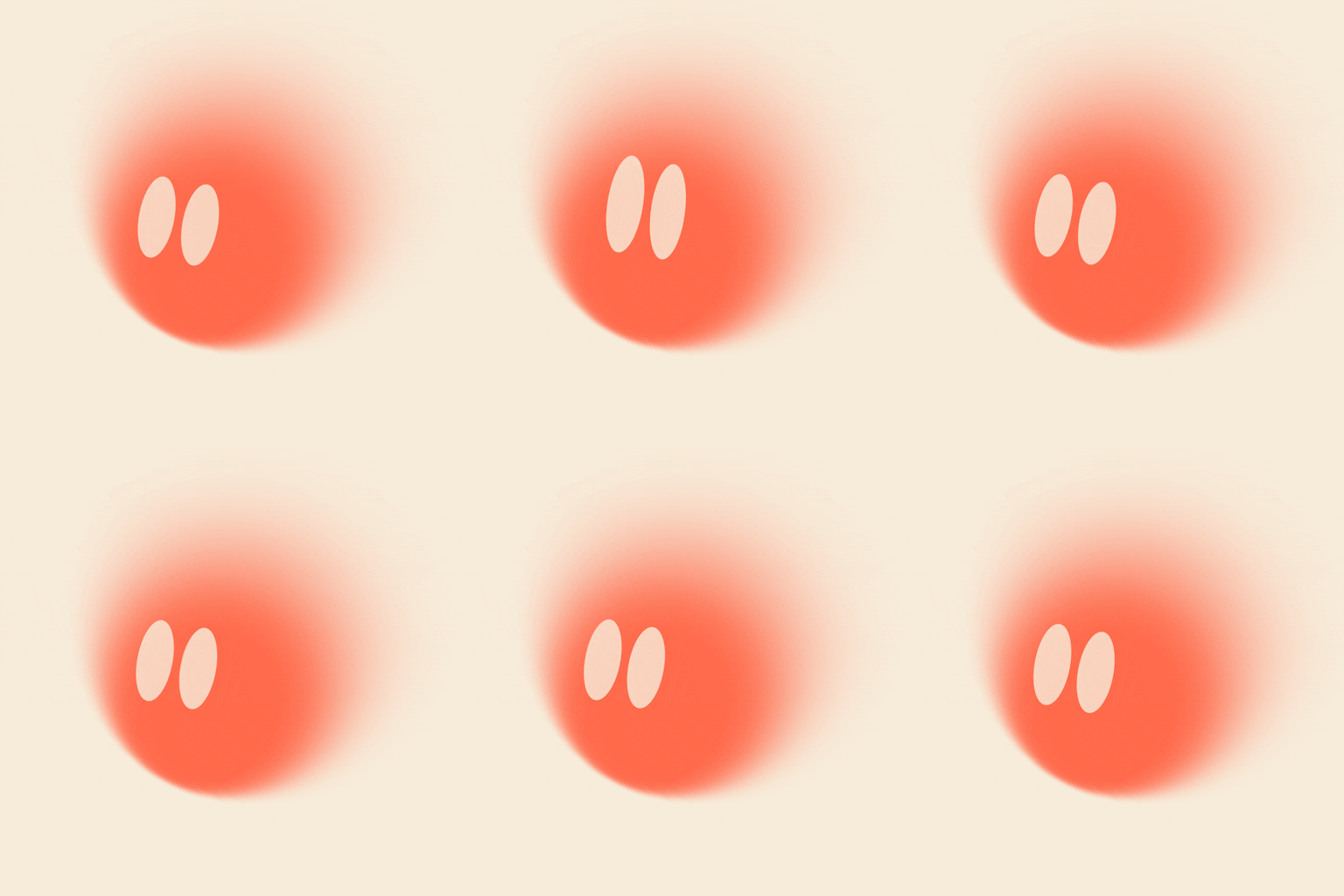
A ray of light: one circle under a progressive blur, crisp at the lower left and melting toward the upper right. Name-literal (Ray), and a quiet nod to how the product works: mostly ambient, sharpest exactly where it lands. No outline, no gradient mesh, one shape. Its signature presentation is cream on coral.



Keep clear space around the crisp circle equal to half its diameter, which is where the glow lives. Nothing crowds it.
A light reads at any size. Below 20px, prefer the coral tile, the cream glow keeps its contrast in a browser tab.
Color
One bold color, used with restraint. Coral carries the mark and the accent layer: links, switches, highlights. Ink owns the primary action and focus rings stay neutral. Cream lives on coral while warm neutrals do the quiet work. Click any swatch to copy its hex.
Typography
Two faces, two jobs. Inter is the voice on screen, a neutral grotesque that gets out of the way. Geist Mono is the technical register: tokens, IDs, timestamps, the things Ray tracks.
Voice & tone
Ray talks like a capable teammate, not a chatbot. It lives in the thread, so every word earns its place. Here is how that sounds, and where it lands.
A teammate, not a bot
Plain, direct, first-person only when it helps. No hype, no exclamation storms, no emoji confetti.
Calm and specific
Say what happened and what's next. Name the ticket, the person, the channel. Specific beats clever.
Shows the receipts
Status is neutral and legible. Cards state facts, and Ray never dresses up a pending action as a win.
Asks before it acts
Anything sensitive, whether it sends, deletes or spends, stops for a one-tap approve or decline. Always.
✕ Hype, emoji spam, and flattery. Ray never celebrates its own routine work.
Wordmark
Lowercase "ray" set in Unbounded at weight 500, outlined to paths: wide, geometric, a firm ground under the glow. Chosen from a 17-face exploration, and the comparison boards live in docs/brand/. Unbounded is OFL, so the logotype is license-free everywhere.
Rules: the word is always lowercase, always outlined (never set live in Unbounded next to UI text), and never recolored off-palette. In running copy the product is written "Ray".
In use
The same mark, sized for where it lands: a browser tab, a home screen, a Slack sidebar.
Loops
The mark alive, as a file: a Slack emoji, an email signature, a social post. Each loop is cut from the same idle life the site runs, starting and ending at rest, so frame one stands alone as a still and the seam never shows.
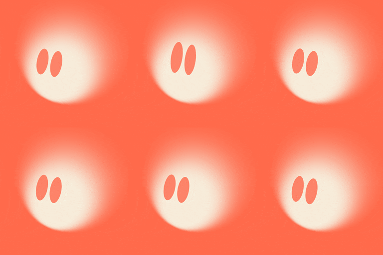
The app icon, alive. The 128 is the Slack emoji, under the 128 KB limit; the 512 and 256 fit a signature or a README.
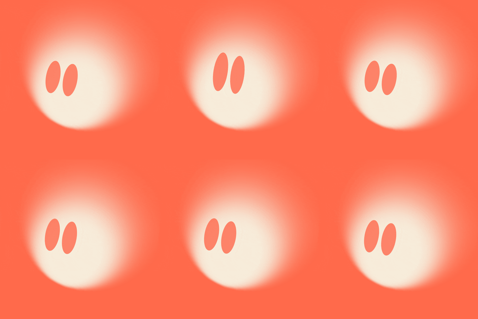

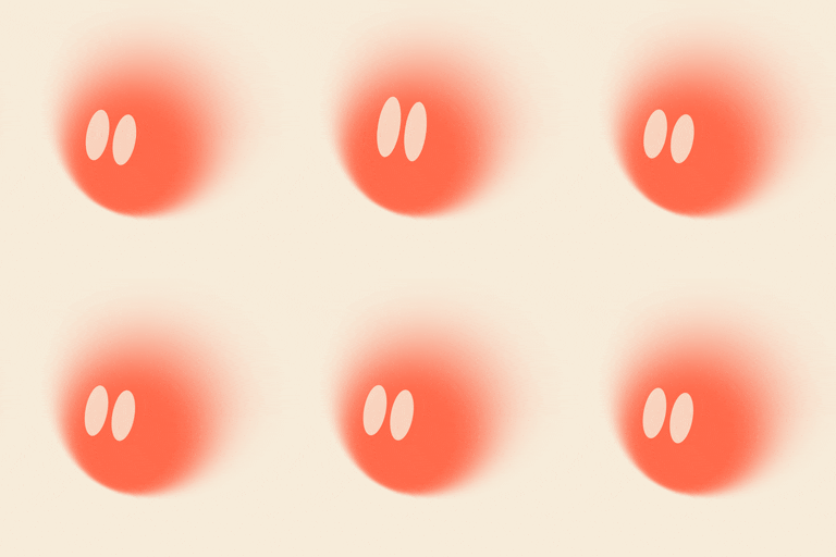
The lockup's mark on the brand cream, for a post or a thumbnail where the tile would read as an icon.